Yaychore branding
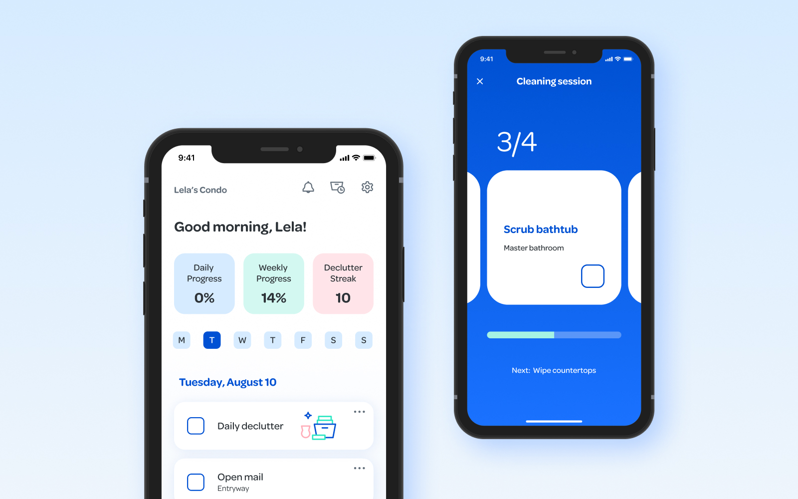
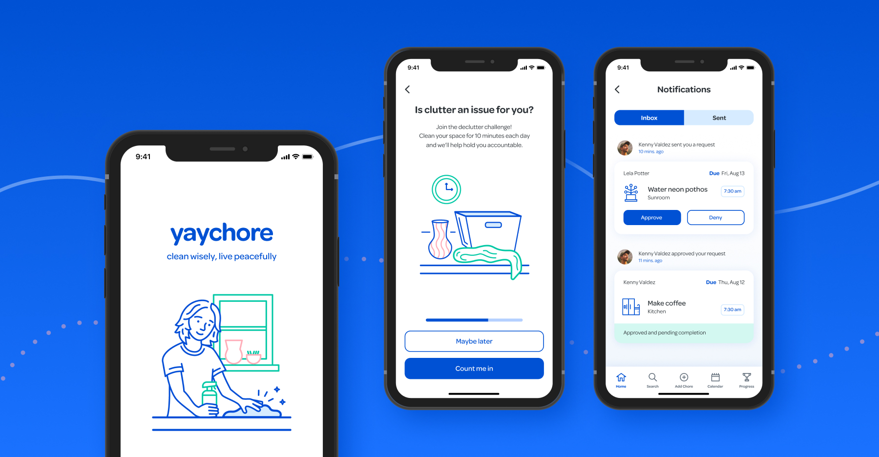
After researching cleaning habits, I decided to create a mobile chore-tracking app concept. Those who I surveyed believe that their busy schedules, health and lack of motivation are affecting their ability to keep their homes clean. While working on the app’s functionality, I created a brand identity and design system, with the surveyed audience in mind.

Brand direction
Creating a friendly experience
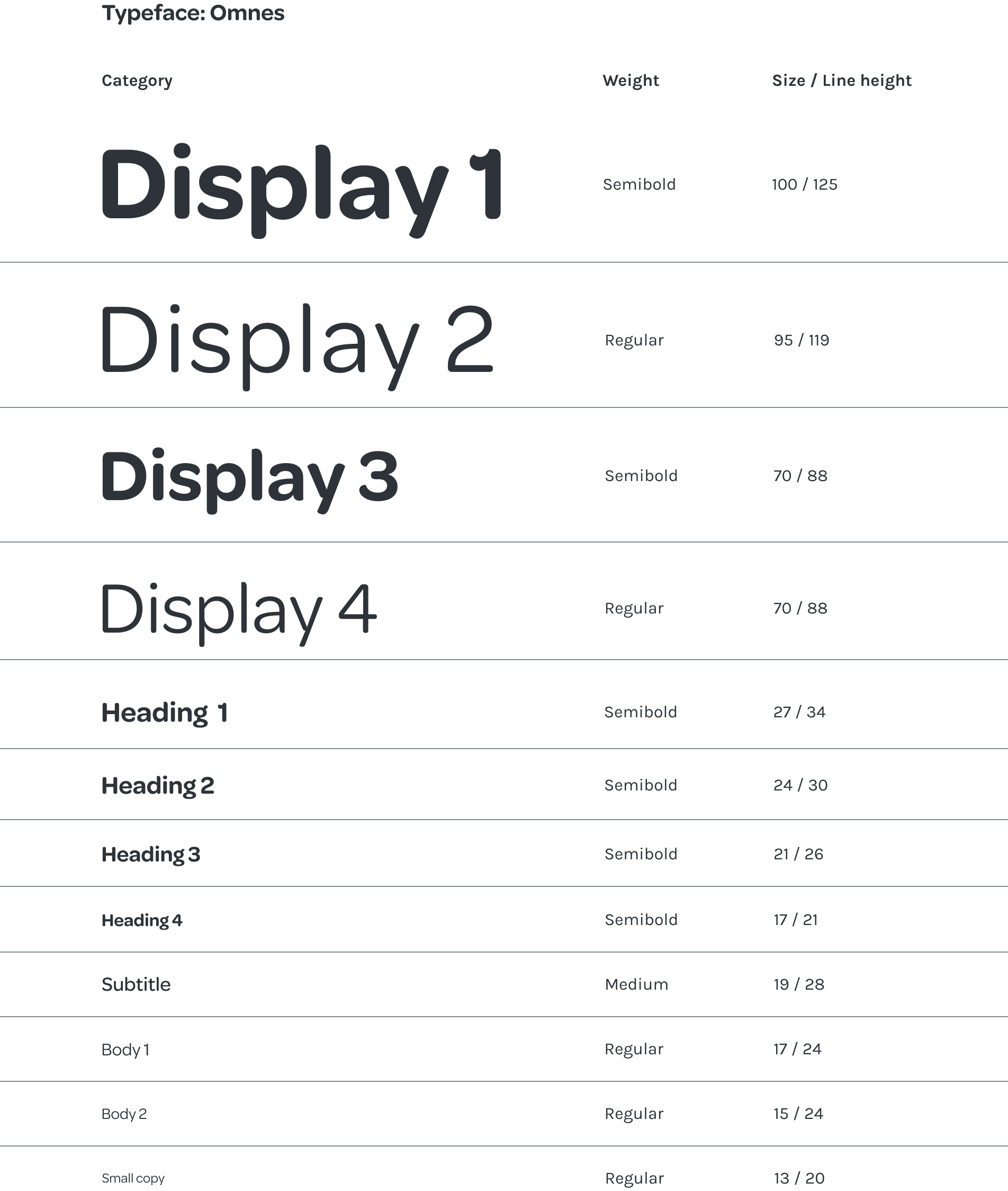
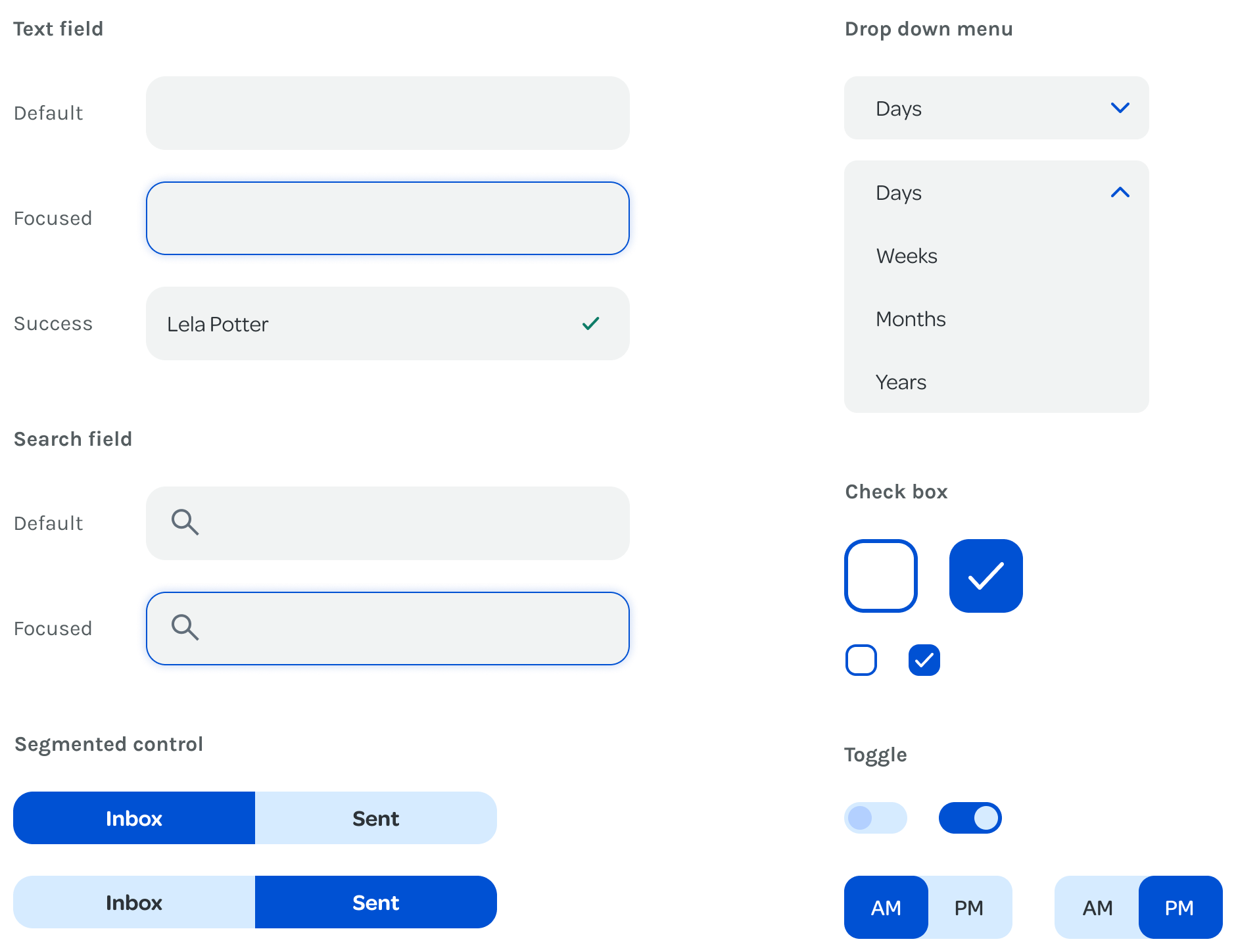
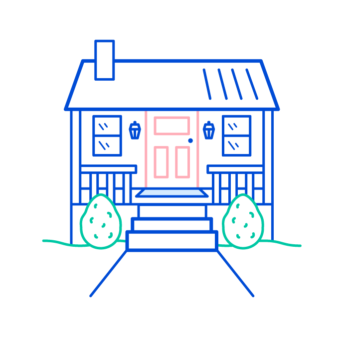
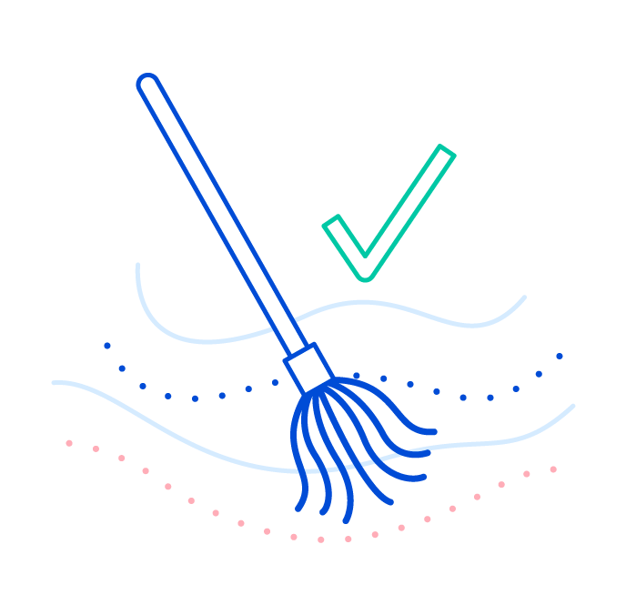
Unsurprisingly, most survey takers reported having neutral or negative attitudes towards completing chores. It was important to create a brand that presents itself with a cheerful and calm demeanor. I selected the name yaychore, as it conveys a jovial and easygoing attitude. To evoke a happy, yet relaxed feeling, I chose a vibrant color palette, featuring shades of blue as the primary color group. Colorful line illustrations, rounded typography and round interface components helped create an approachable looking interface.


Design system
Color palette
Primary Colors
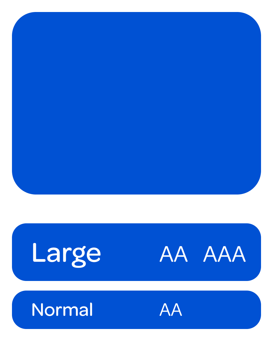
Blueberry twilight
#0051D3

Hydrangea hype
#B3D0FF

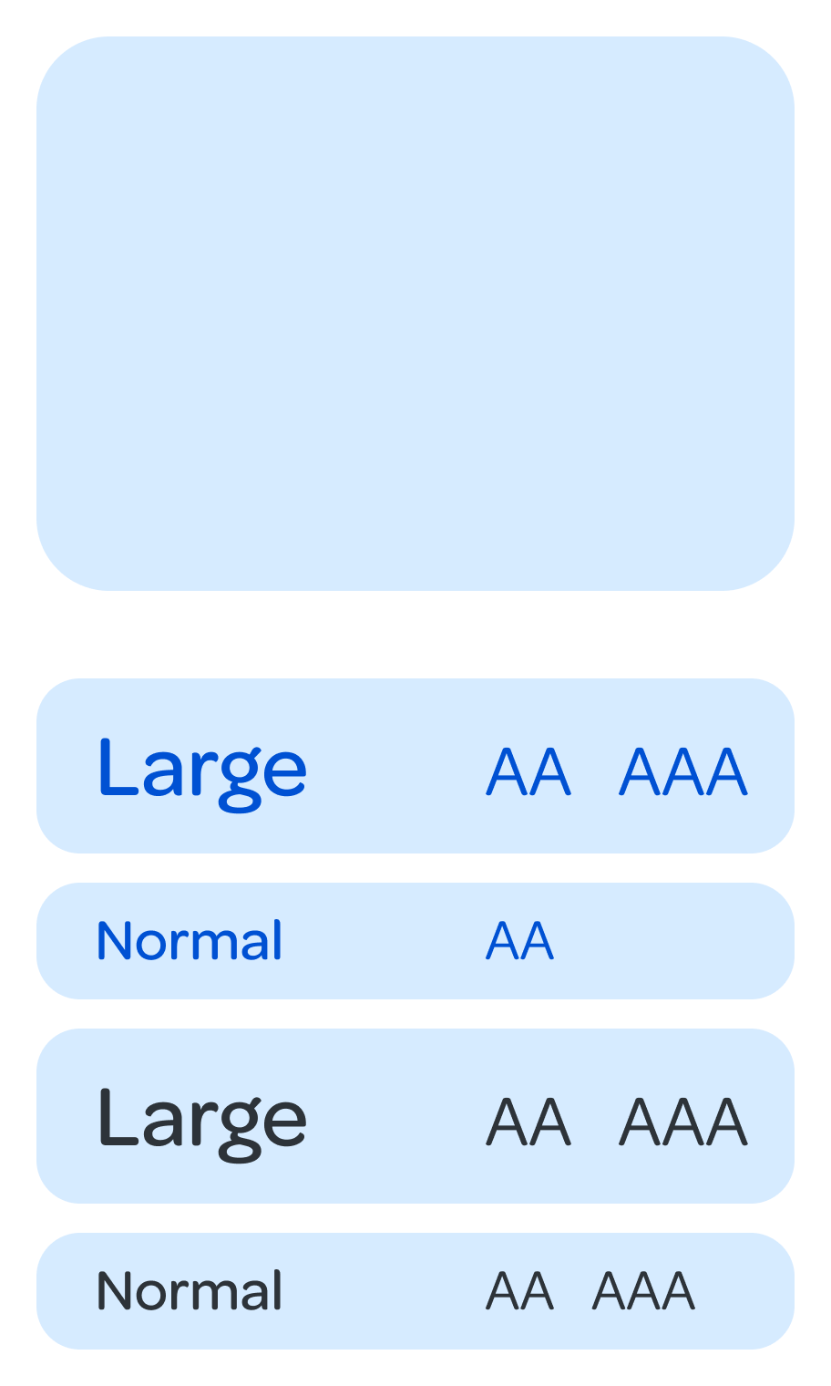
Soapy bubbles
#D6EBFF
Ice sculpture
#EEF5FC

Secondary colors
Garden gnome
#17C7A5

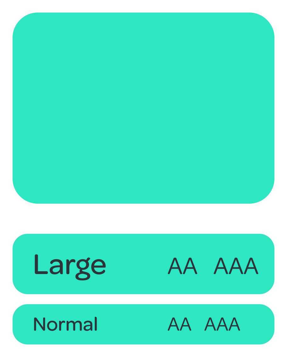
Lagoon tile
#2DE7C3
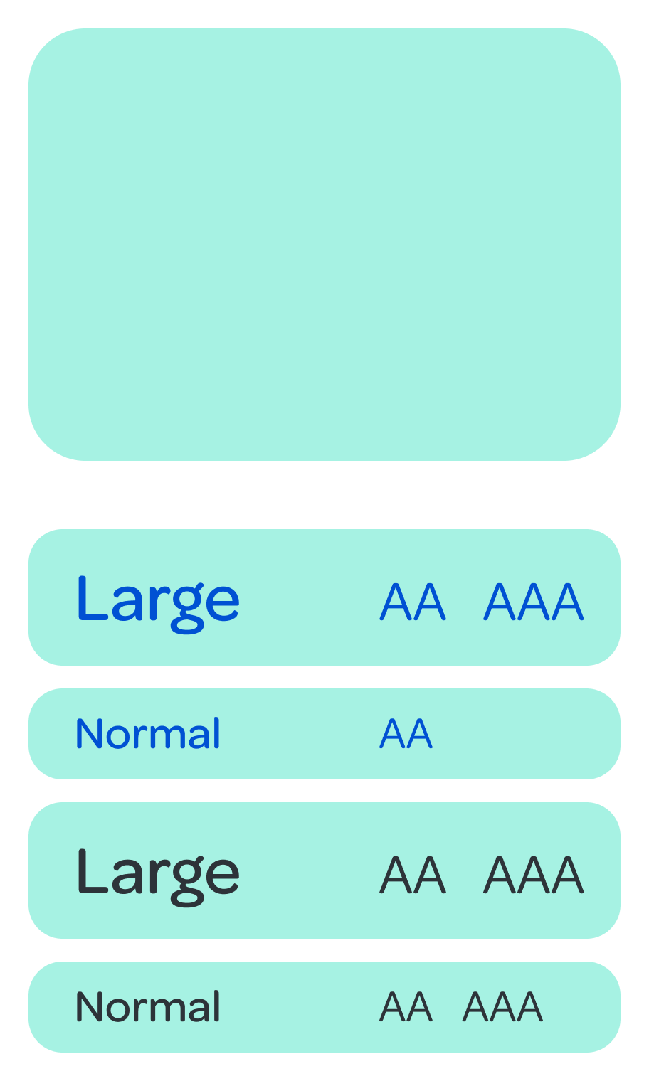
Pool float
#A6F2E3
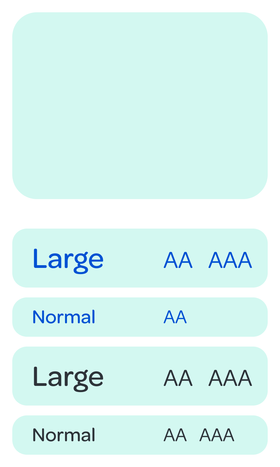
Mint frosting
#D3F8F1
Raspberry jam
#FFAEB9

Party Punch
#FFAEB9

Pink lemonade
#FFCCD3

Rose quartz
#FFE5E9

Neutral Colors
Midnight dinner
#2D3339

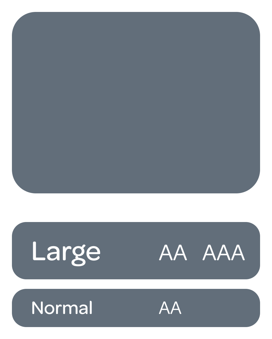
Stone fountain
#626E7A
Fuzzy sweater
#A7B0B9

Rain cloud
#E6E8EB

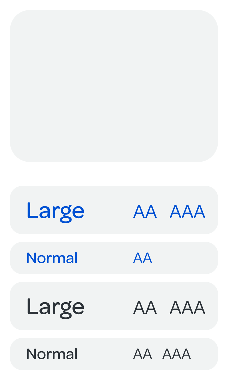
Soft linen
#F1F3F3
Daisy petal
#FFFFFF

Alert colors
Success
Kale salad
#0E7C67

Error
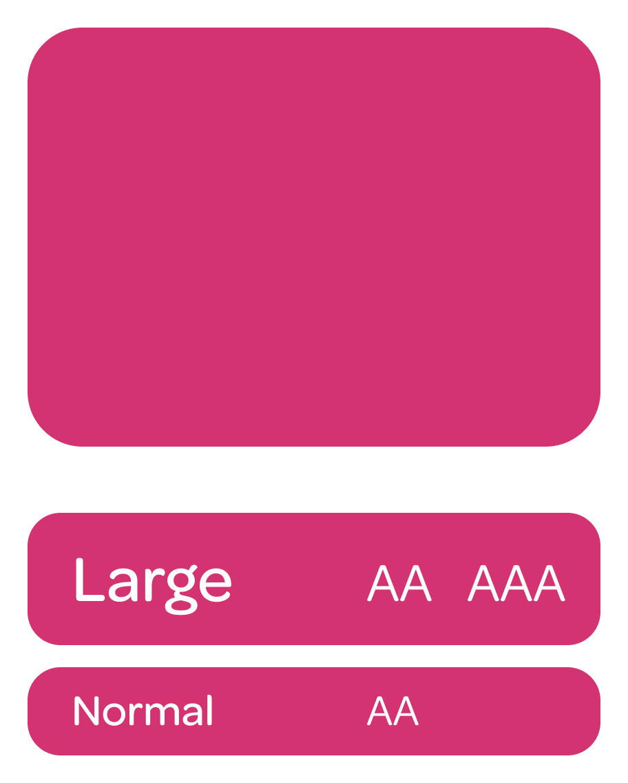
Raspberry jam
#D33371
Warning
Carrot juice
#D33371

Information Blueberry twilight
#0051D3
Typography
Iconography
Buttons

Controls & Forms
Cards

Menus

Illustrations



Badges


